This article was originally published on the HubSpot Blog
How to Send Effective Order Confirmation Emails [Examples + Template]
Ultimately, when done right, email confirmations can help create customer loyalty, build awareness around other products or services, and drive traffic to your blog or social media accounts.
If you're a frequent online shopper like I am, you're likely already well-acquainted with order confirmation emails.
At its most basic, an order confirmation email needs to signal to the customer that their order has been processed — without receiving one, a customer might believe their transaction hasn't gone through properly.
But an order confirmation email can do more than just act as a digital receipt.
For instance, take a look at the order confirmation email I received from Massachusetts' Franklin Park Zoo, upon my recent purchase:

This email provided me with all the information I needed, but it also made me feel good about my purchase by letting me know that my money was helping support conservation efforts.
Ultimately, when done right, email confirmations can help create customer loyalty, build awareness around other products or services, and drive traffic to your blog or social media accounts.
Order confirmation emails are also phenomenal for lead generation. In fact, order confirmation emails have the highest average open rates of all email types, with about a 70% open rate. So if you're not optimizing your order confirmation emails, you're missing out on a major opportunity to engage with your customers.
Here, we're going to explore some unique and effective order confirmation email examples to provide inspiration for your own transactional emails. We've also included templates to help get you started on your own order confirmation email.
Order Confirmation Email Examples
1. Uber
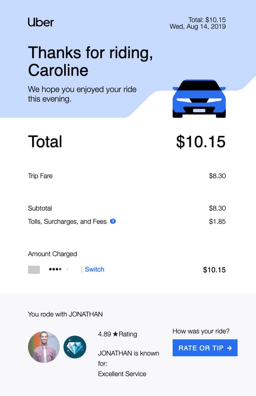
Uber's order confirmation emails are sleek, clean, and aesthetically-pleasing, with large text, plenty of white space, and a blue CTA to incentivize the rider to “rate or tip” the driver. The email is organized so the rider sees the most critical information above-the-fold — “Thank you” followed by the price — to ensure the recipient only needs to scroll if they want to.
2. JetBlue
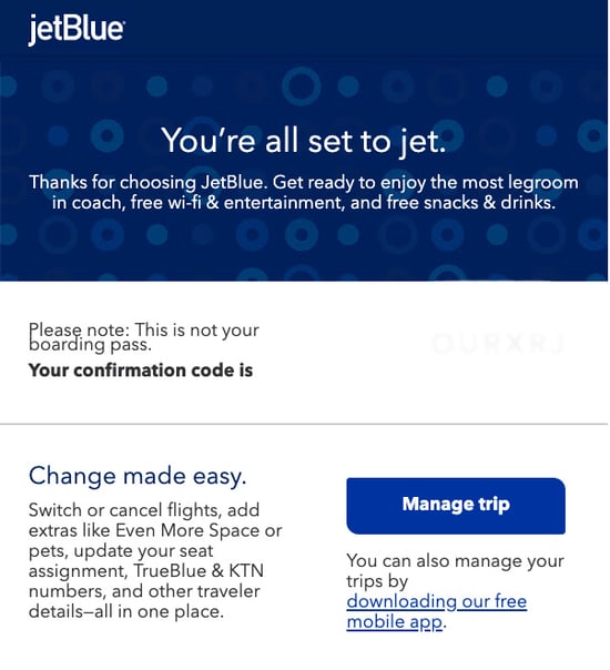
JetBlue's order confirmation email opens with their fun and clever slogan, “You're all set to jet”, which immediately reassures the recipient that their order was successfully processed.
Additionally, the text below the initial slogan promises the recipient “the most legroom in coach, free wi-fi & entertainment, and free snacks & drinks” — even though the recipient has already paid, JetBlue does a good job ensuring the customer doesn't experience any buyer's remorse, and uses the order confirmation email as another opportunity to cultivate stronger customer loyalty.
Below the confirmation, JetBlue provides a simple “Manage trip” CTA, so the customer can easily update a seat assignment, add extras, or switch flights. Best of all, they've included a link to their mobile app — it's likely that any customer receiving an order confirmation from JetBlue will need their app to access their mobile ticket, so it's a smart strategy for JetBlue to include the app link.
3. Hausera
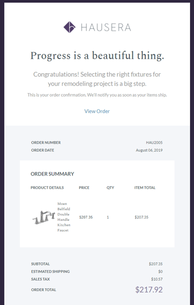
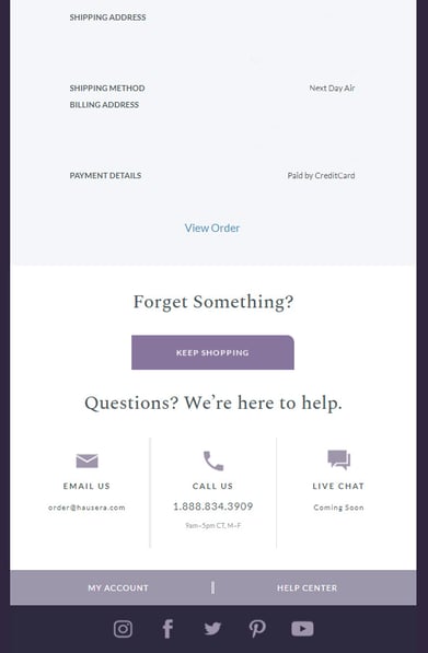
Hausera, an ecommerce site that sells kitchen and bathroom fixtures for remodeling projects, does an excellent job ensuring their order confirmation email is sleek while offering the recipient any information they may need. At the beginning, they've included positive messaging like “Progress is a beautiful thing” and “Congratulations” to thank the customer for their order.
Additionally, below the order summary, they include helpful CTAs such as “Keep Shopping”, as well as options to either email, call, or live chat with a support rep. Whether a customer has an issue with their order or simply wants to continue perusing Hausera, the ecommerce site does a good job ensuring the customer can find next-steps from within the order confirmation itself.
4. Tobi
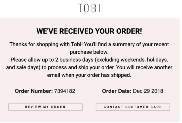
Tobi's order confirmation email is simple and straightforward. The ecommerce site offers two critical CTAs — “review my order” and “contact customer care” — within the email itself so that the recipient is able to immediately check and correct any information if their order doesn't look right.
Tobi also effectively outlines their order process within the body text of their email, telling the customer “Please allow up to 2 business days to process and ship your order. You will receive another email when your order has shipped.” By including this information in their email, Tobi ensures minimal outreach from customers who are wondering when their order will ship, or why they haven't received shipping information already.
5. BigStub
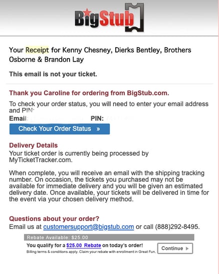
BigStub's order confirmation email, while admittedly text-heavy, does a good job providing the customer with plenty of critical information throughout their email, including a CTA to check order status, a phone number to contact customer support, and a note regarding delivery details for the recipient's ticket.
Additionally, BigStub offers a $25 rebate within the order confirmation email with enrollment in Great Fun. Even if the customer doesn't apply for the rebate, the inclusion is still an effective method that allows BigStub to potentially boost positive brand perception.
6. JustBats
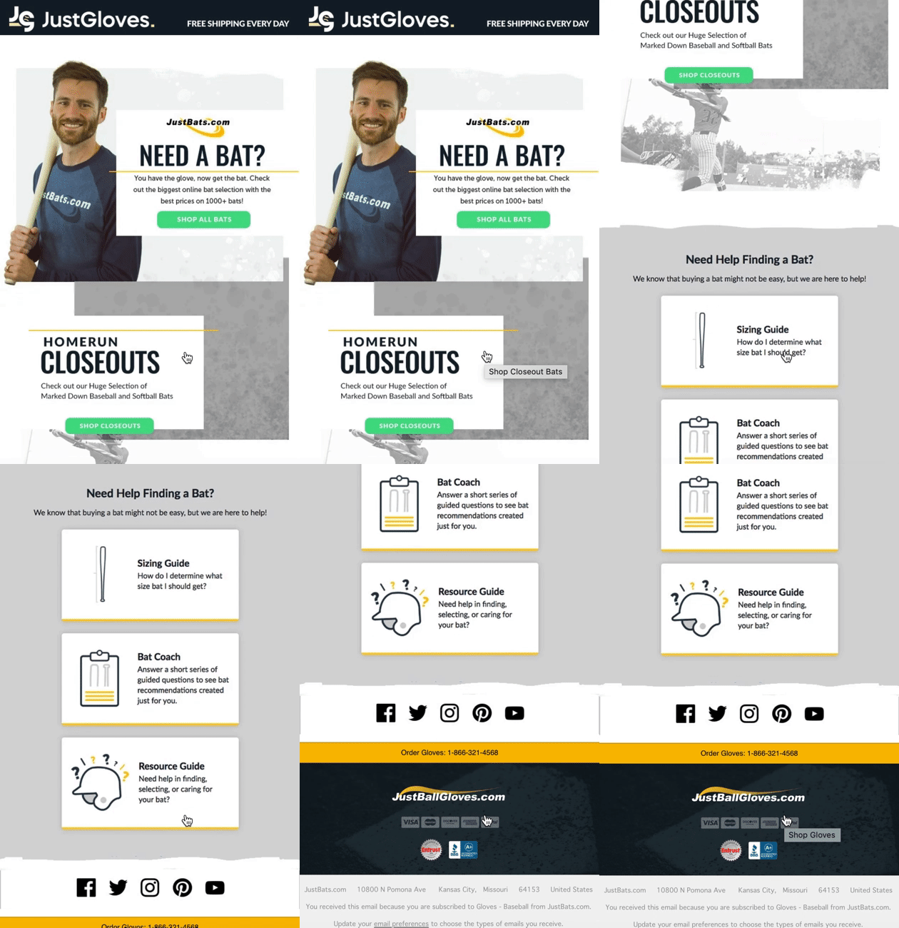
JustBats, an ecommerce site that sells baseball and softball equipment, does an excellent job of cross-selling other products in their order confirmation emails. For instance, if you purchase a glove on their site, you'll receive an email with the following message — “Need a bat? You have the glove, now get the bat.”
The rest of the email is designed to help a user choose a bat, with CTAs like “Shop all bats” and “Shop closeouts”, as well as helpful resources to ensure the recipient is able to find the right bat for his or her needs. Alternatively, if you purchase a bat from their site, you'll receive an order confirmation email that helps you choose a glove.
JustBats proves an order confirmation email can be an effective opportunity to suggest other relevant products or services, particularly since the order can help you understand the customer's needs. In the above example, a glove is a logical next step for someone who has just purchased a bat, and vice versa.
7. SoulCycle
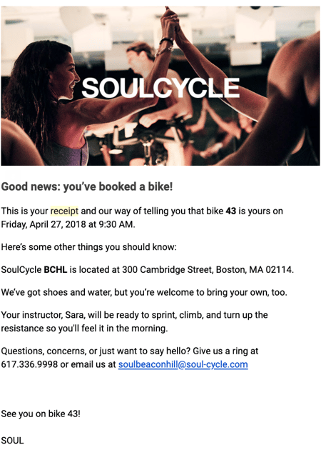
SoulCycle's order confirmation email, while simple, effectively provides all relevant information and demonstrates SoulCycle's ability to go above-and-beyond in customer service. Once they've outlined when, where, and on which bike the customer will be riding, SoulCycle includes other useful information including studio address, and a note that shoes and water will be provided.
At the bottom of their email, they send a cheerful invitation that reads “Questions, concerns, or just want to say hello?” with both a phone number and email if the recipient needs to reach customer support.
Ultimately, it's important to pay attention to your language in your order confirmation email, and look for areas where you can add brand voice.
Order Confirmation Email Template
There are plenty of online sites with email templates that allow you to build an order confirmation email today.
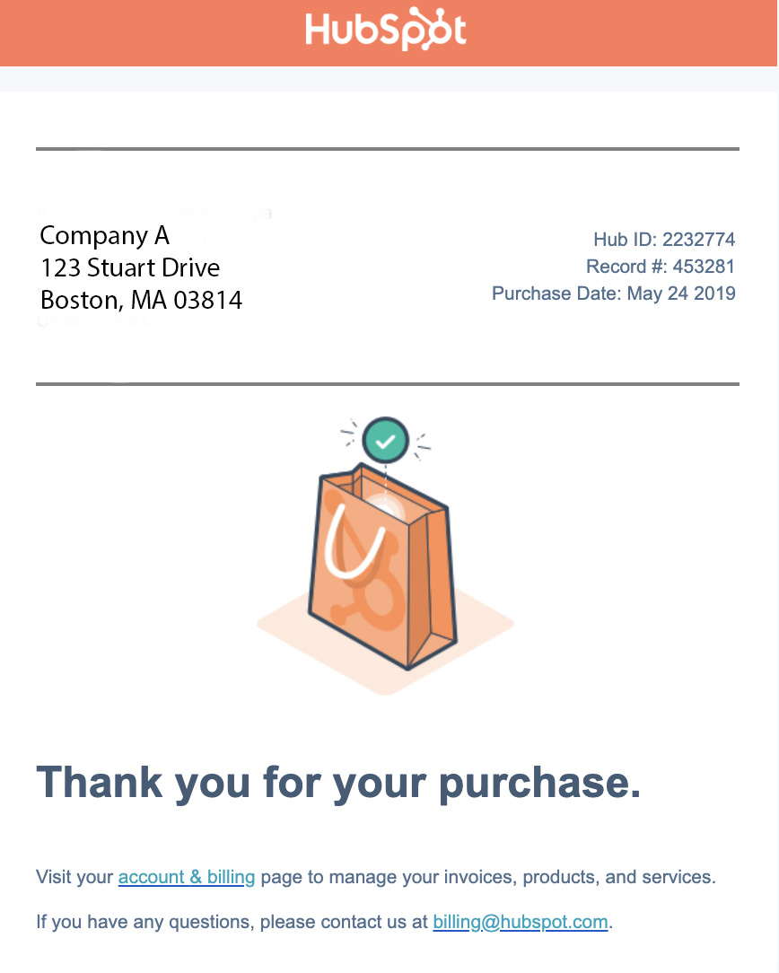
For instance, you can create an order confirmation email within the HubSpot Email Marketing tool for free. You can either choose a pre-made template and customize text, images, and overall design, or you can create one from scratch. Here's an example of an order confirmation email made with HubSpot's email tool:
There are plenty of other order confirmation email templates available through tools such as Stripo et Squarespace.
Alternatively, if you use an ecommerce website builder like X-Cart, you can use one of their email tool add-ons to create your own order confirmation email within the tool.
It's important to note — there are a few best practices you'll want to follow regardless of the template builder you use.
For instance, it's critical your order confirmation email:
- Is mobile-friendly, since many recipients will check their email on their phones to see whether an order processed.
- Is skim-able, since many customers are on-the-go and don't have time to read dense text. If you have important delivery information you'd like to include, consider linking to it instead of including it in the body text.
- Provides an email and phone number of your customer support, in case the recipient's order is incorrect.
- Outlines next-steps, i.e. when the customer should expect an order to ship, or how the customer can find/track their order.
- Includes shipping address, payment method, and order number.
Additionally, consider how you can include brand voice in your text to cultivate customer loyalty, particularly with first-time customers who might not know your brand yet. You might also add links to your social media accounts or blog, so new customers can find other ways to engage with your brand.
Order Confirmation Page
Typically, when a customer places an order, they'll see a confirmation page before they even receive the confirmation email.
For instance, here's what you'll see when you place an order on Amazon:
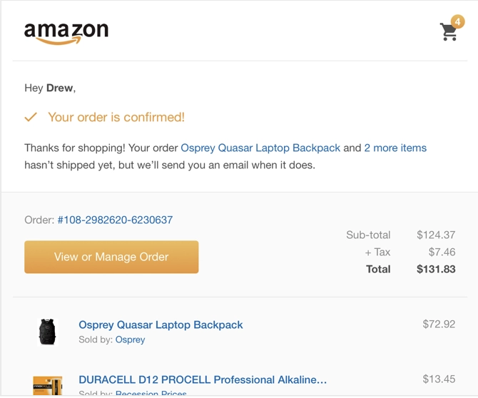
Ultimately, an order confirmation page is a page you're re-directed to when you click the “Buy” or “Purchase” button, and signifies that an email should be on its way. An online confirmation page is a temporary notice that tells your customer that their transaction went through correctly. If a customer doesn't see this page, he or she will likely assume their transaction didn't work.
When you're creating an online confirmation page, here are a few things you should include:
- Messaging such as “Success! Your order is confirmed”, as well as a note that the customer should expect an email in their inbox soon.
- An order number, delivery details, and order summary (including total cost).
- Optional: Images of the products or services bought.
Additionally, you might include other relevant “Popular Items Based On Your Order” on a customer's order confirmation page, to incentivize them to purchase other related products. For instance, if they've purchased a blender on your site, perhaps you want to show them a smoothie recipe book on their order confirmation page.
Ultimately, it's critical you remember your order confirmation page and email can serve as major lead generation opportunities if you optimize them correctly, and will ensure your customer feels supported throughout their entire buyer's journey.
