How to use
This guide is to be used while creating any communication collateral for Digital Main Street. It should be referenced at every stage of the design process to ensure a cohesive look and feel, which contributes to overall brand success.
Logos & Use
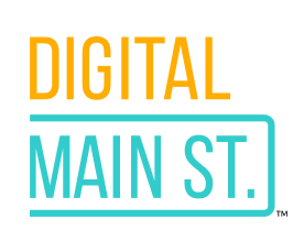
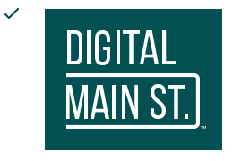
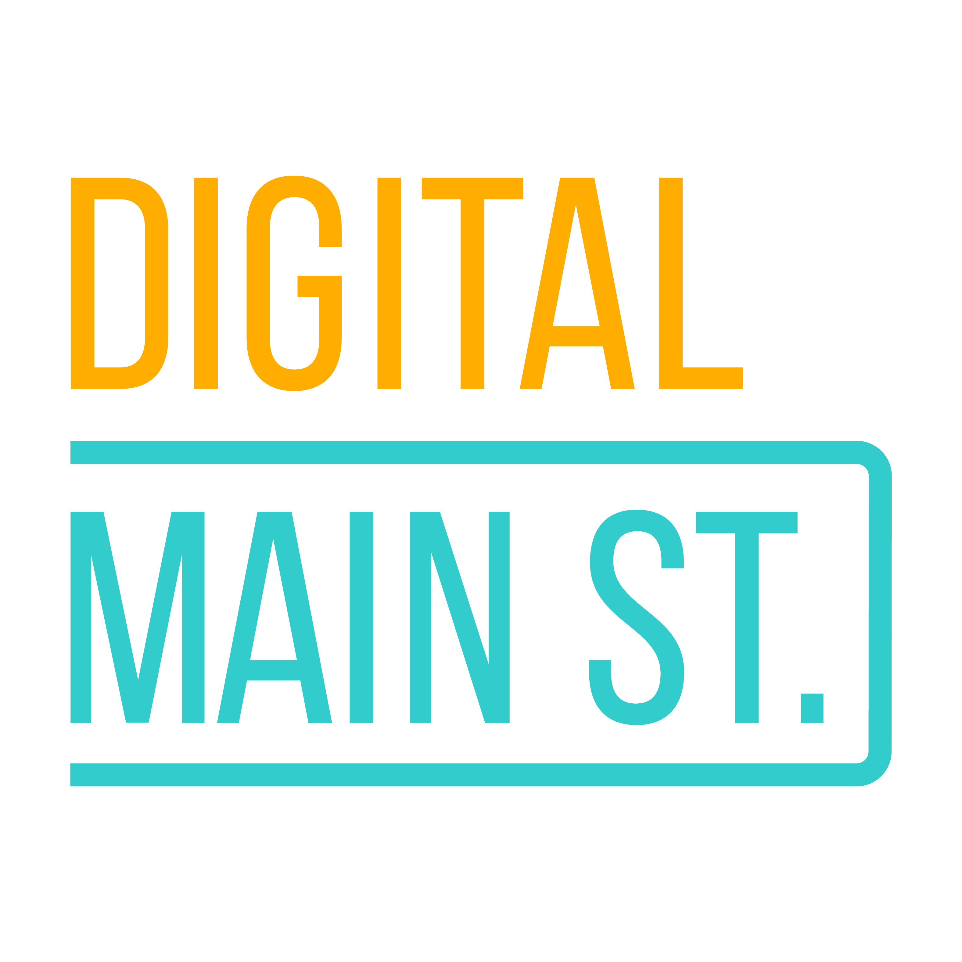
Primary logo
This is the primary logo for Digital Main Street. In every instance possible, this is the version that should be used.
Clear Space
There should be at least the width of the letter ‘M’ in relative distance between this logo and any other elements, text, or distracting backgrounds. For more, see the logo violations examples.

Alternative logo
This small version of the logo may only be used in special circumstances where space does not permit the use of the primary logo. Acceptable instances include a favicon, for example. Use this as a last resort after exhausting all other possible solutions.

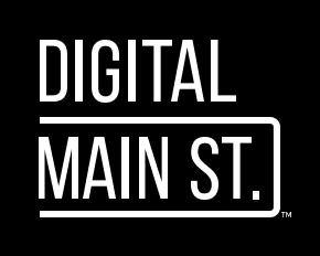
Alternative Colours
In all instances possible, the full colour version of the logo should be used. When that is not possible, white is an acceptable alternative colour choice. Black should be a last resort.

Program Logos
All program logos, with the exception of ShopHERE, shall be displayed with all-caps text and in the styles exemplified below. The second word should always be encapsulated with the street sign line and the colours should be consistent with the Digital Main Street logo. All other logo guidelines also apply to the program logos.
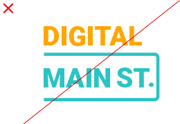
Logo Violations
Framing
Do not position the logo within encapsulations or frames.
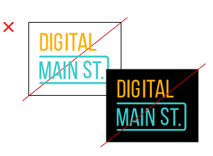
Instead, choose a layout that does not require a boxed logo.

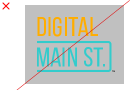
Over Images
To ensure clarity of the logo, it must not be placed overtop a busy background.
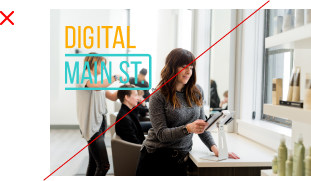
Instead, position the logo on a low contrasting area of the image. If it’s a darker image, try using the white version of the logo.

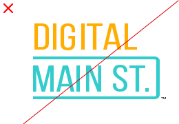
Contrast
Do not position the logo on a background with insufficient contrast.
Instead, choose a lighter, more neutral background. If a dark background is necessary, consider the white version of the logo.
Effects
The logo should not appear with any effects such as drop shadows or outlines.

Instead, ensure the logo has enough legibility to stand on its own.

Scaling
The ratio of the logo should never be stretched vertically or horizontally.
Instead, try locking the ratio in your design tool to prevent accidental skewing.
Minimum Size
This logo should never appear smaller than 1 inch in width in printed material and less than 80px wide in digital spaces.
Make sure the logo is large enough to be legible.
Recreation
Do not attempt to recreate the logo. For example, do not use a different typeface.
Instead, leave the logo as is and download the official logo files here.
Brand Colours
Do not deviate from the brand colors specified within this guide.

This is the only instance where color can be used in the DMS logos.
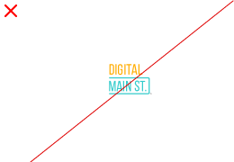
Axis
The logo should never be rotated, angled or skewed.

Instead, leave the logo as is.
Colors
It is imperative to identify whether what’s being created is going to be viewed online or printed, and choose the corresponding color space. These colour codes below have been manually selected and optimized for their medium, meaning they will not translate automatically and need to be adjusted and monitored manually. For example, if you’re creating a document for general printing, make sure the document colour mode is CMYK and enter the CMYK values, disregarding the other colour space values.
Primary Colours
These are the main DMS colours. They are primarily used for text and special call outs like buttons. Sometimes, they can be used as background colours, like on the business cards for example.
C0 M35 Y100 K0
R255 G173 B0
HEX #ffad00
C65 M0 Y25 K0
R51 G204 B204
HEX #33cccc
C92 M50 Y57 K35
R3 G80 B83
HEX #035053
C60 M40 Y40 K100
R0 G0 B0
HEX #000000
Secondary Colours
C5 M44 Y100 K0
R237 G154 B21
HEX #ED9A15
C0 M35 Y100 K0
R255 G173 B0
HEX #FFAD00
C0 M21 Y67 K0
R247 G201 B109
HEX #F7C96D
C1 M10 Y32 K0
R251 G227 B181
HEX #FBE3B5
C0 M5 Y14 K0
R255 G240 B217
HEX #FFF0D9
C1 M1 Y2 K0
R252 G250 B247
HEX #FCFAF7
C78 M16 Y38 K0
R19 G161 B164
HEX #13A1A4
C41 M0 Y19 K0
R140 G224 B218
HEX #8CE0DA
C18 M0 Y7 K0
R201 G244 B242
HEX #C9F4F2
C10 M0 Y3 K0
R224 G252 B250
HEX #E0FCFA
C4 M0 Y1 K0
R243 G255 B254
HEX #F3FFFE
C90 M58 Y64 K62
R1 G48 B48
HEX #013030
C78 M27 Y45 K4
R48 G140 B132
HEX #308C8C
C46 M6 Y26 K0
R138 G196 B191
HEX #8AC4BF
C19 M1 Y10 K0
R204 G231 B229
HEX #CCE7E5
C9 M1 Y5 K0
R230 G241 B240
HEX #E6F1F0
C60 M40 Y40 K100
R0 G0 B0
HEX #000000
C69 M63 Y62 K58
R51 G51 B51
HEX #333333
C52 M43 Y43 K8
R127 G127 B127
HEX #7F7F7F
C29 M23 Y23 K0
R183 G183 B183
HEX #B7B7B7
C10 M7 Y8 K0
R226 G226 B226
HEX #E2E2E2
C3 M2 Y2 K0
R244 G244 B244
HEX #F4F4F4
Typography
Titles & subtitles
Body copy
Logo font
Imagery


Icons
Icons use a simple line art style and the DMS colour palette. These icons should be as simple as possible without losing context. Often, they are displayed within a circle. These can include 2-3 different colours.


Graphic Elements
Bricks to clicks


Triangle corners

No More Coloured Gradients

Digital Applications
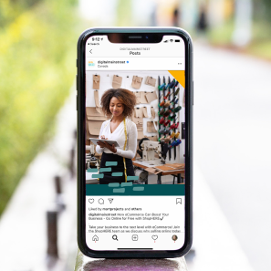
The following are guidelines specific to the medium being created. Please keep this in mind as you’re creating. Use this photo as an example of the guidelines below.

Logo placement
Colours
Contrast & Legibility
Print Applications
In addition to the guidelines for digital applications, there are a few print-specific guidelines to keep in mind. Use this photo as an example of the guidelines below.
Bleed
Colours
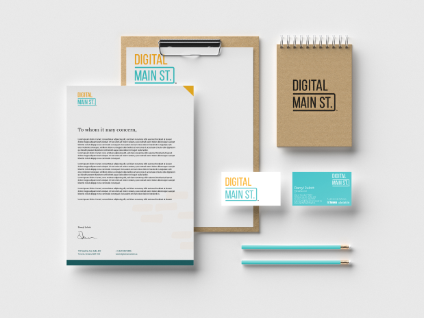
Example Collateral
Stationery (business cards, letterhead)
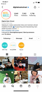
Social Media Profiles
